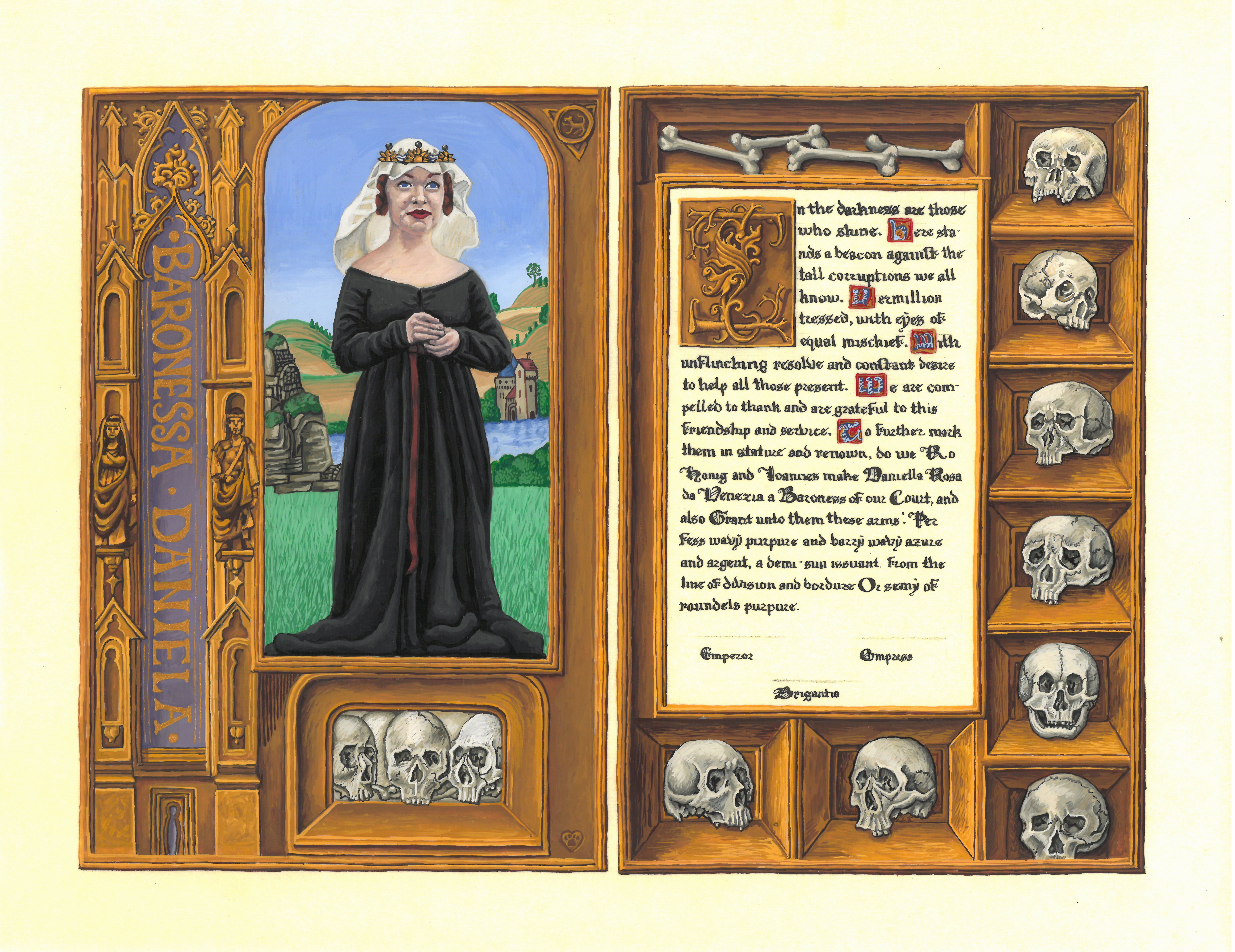
A Scroll Done in the Style of A Page from the Rothschild Prayerbook c. 1505-1510
About Flemish Manuscripts
Illuminated manuscripts were collected by the most powerful and wealthy throughout Europe and served as a symbol of “piety, politics, and status”. Between 1470 and 1560 was the golden age for Flemish manuscripts. During this time, borders became more ornate and complicated, transitioning from previously common two dimensional designs to more three dimensional illusions of reality and naturalism. These illusionistic borders became a trademark of Flemish manuscripts during this time period. This period also gave rise to superstar illuminators that were in high demand throughout the great courts of Europe, which led to great opportunities for these artists.
The Rothschild Prayerbook is a book of hours that dates back to the early 16th century, specifically 1505-1510 AD. It is presumed to be from Ghent or Bruges. The book is renowned for being one of the most spectacular and highest quality manuscripts of the Renaissance, both in artwork and materials. It is one of a group of manuscripts-de-luxe produced around 1490-1520 for members of the Habsburg court in the Netherlands and other international patrons.
About the Scroll
The Rothschild Prayerbook, like most manuscripts at the time, was made with vellum, a fine quality parchment prepared from the skin of a young animal. I chose to use pergamenata, a synthetic plant material made from interior tree bark, for this scroll. I enjoy the look of the paper and how it resembles the look of the pages from the manuscripts. The original Book of Hours is approximately 6 x 9 inches closed. This scroll is 11 x 14 inches, imitating an open spread of the book, but slightly larger.
This scroll was made for a Court Barony. It is very important for me to personalize the scrolls I make to fit the recipient. I chose this page full of skulls because of the recipient’s love for all things gothic. Since illuminated manuscripts were symbols of power, portraits of high ranking families only elevated the power and status of the owner of these books. Due to the prestige and high ranking status of the court barony award, it seemed fitting and right to include her likeness in the scroll.
The calligraphy is done in Gothic Textura Prescisus. It is a form of the gothic hand that was used from the thirteenth century on. It took several rounds of practicing the text before it was written onto the scroll itself. The ink I used was Higgins Eternal. Historically, iron gall ink would have been one of the inks used. Unfortunately, it does not chemically mix with pergamenata, so therefore, I could not use it for this project.
Common pigments used during the 1500’s included but are not limited to Carbon Black, Terre Verte, Ultramarine, Lead White, Orpiment, Yellow Ochre, and Vermillion. On this scroll, I used Carbon Black, Terre Verte, Ultramarine, Yellow Ochre, and Vermillion. I chose to exchange the Lead White for Permanent White and Orpiment for Primary Yellow as the former colors are highly toxic. My paints were a mix of Windsor Newton and Holbein gouaches. Instead of shell gold, I used Holbein Rich Gold gouache, because it is what I have available locally.
EK Wiki: https://wiki.eastkingdom.org/wiki/Aurelia_Colleoni_a%27Buccafurno
Website: https://lionspridesca.wordpress.com/
Full Documentation: https://docs.google.com/document/d/1g3zwvZw2oEH2lorNfDiFFfP7HbMDGSS73Fh4CiCX4nc/edit?usp=sharing

That is lovely!
That’s excellent. The shadows are nicely done. I love the motifs!
That is so, so stunning! The tromp l’oeil turned out amazingly; I love how 3-D the skulls and the “woodwork” are! And all of the tiny little details you add…I am in awe of your skills.
This is supurb work. I love every little detail and the shading is just so so excellent.
This is really impressive. I love seeing your artwork.
The dimension you have created is incredible. Beautiful work! I would love to see this in person!
Wow, that’s a work of beauty. There’s so much fine detail work!